Why a Pretty Website Isn't Enough: 5 Conversion Fixes That Turn Visitors Into Enquiries
A beautiful website that doesn't generate leads is an expensive brochure. Here are the five fixes we make most often — and why they work.
We see it every week: a business owner has spent thousands on a beautiful new website, and it generates almost no enquiries. The design is gorgeous. The copy is well-written. The problem is that the site was built to look good, not to convert. Here are the five fixes we make most often.
1. One clear call to action on every page
Every page on your site should have one obvious next step. "Call us", "Get a quote", "Book a strategy call" — pick one and make it impossible to miss. If a visitor has to think about what to do next, they leave. A page with three competing buttons ("Learn more", "Contact us", "See our work") splits attention and converts worse than a page with one.
2. Mobile-first layout that reads on a phone in the sun
More than 60% of Australian business searches happen on a mobile phone, often outdoors. If your text is too small, your buttons too close together, or your forms require pinching to zoom, that visitor is gone. Design for the phone first, then scale up — not the other way around.
3. Fast load times (under 2 seconds) keep people from bouncing
Every extra second of load time drops conversions. A site that loads in 1.5 seconds converts roughly 30% better than one that loads in 4 seconds. We build for speed from the first line of code: optimised images, minimal scripts, and edge-delivered content.
4. Trust signals: reviews, guarantees, real photos
A visitor who has never heard of you is taking a risk. Reviews, a clear guarantee, real photos of your team, and verified Google Business Profile badges all reduce that perceived risk. A site with no reviews and stock photos reads as "might be a scam" — even when it is not.
5. Forms that ask only what's needed to follow up
Every field on a form is friction. A contact form that asks for first name, last name, email, phone, company, budget, and "how did you hear about us" will be abandoned by most visitors. Ask for the minimum needed to follow up — usually name, email, and one qualifying question — and use the rest of the conversation to learn more.
The pattern behind all five
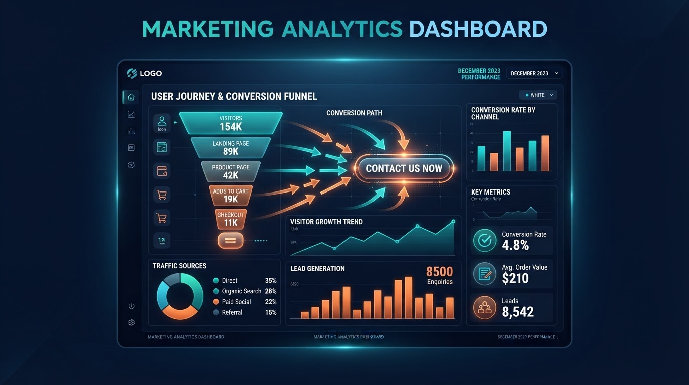
Every one of these fixes is about removing friction between the visitor and the action you want them to take. A pretty site adds friction when it confuses, slows, or distracts. A conversion-focused site removes it. If your website looks good but is not generating enquiries, the design is not the problem — the strategy is.
Want a second opinion on your site? Book a strategy call and we will walk through it together.
Website design, CRM automation & branding →
Your local teamWebsite design & CRM across Logan, Brisbane & Australia →
Want results like this for your business?
Talk to Martin & Tabitha about website design, CRM automation and branding — taking the overwhelm out of marketing your business.